Monday, 10 March 2014

Taking Photographic Images for Purpose - Portraits

This is a photograph I took of my brother whilst on holiday. I think this is a good photo because of the bright colours, like the blue from the sky, and the light and shadows on his face. Also, you can clearly see the person and the expression on their face.


This is a candid shot I took of a friend. I think this is a good image because of the bright colours of the person's shirt and the background. Also, you can clearly see the person's face and expression.


This is a candid shot I took of my friend, Rhiannon. I think this is a good photo because you can see the texture of her hair and fabric of her clothes with contrasts well to the smoothness of the background and her face. I think this photo would be better if it wasn't in black and white so there would be more colour. Also, you cannot see this person's face very clearly.


Taking Photographic Images for Purpose - Concept - Close-up/Macro Shots


This is a photo of a rock on the ground in a forest. I think this is a good photo because of the rough texture of the rock and the ground. I also think it is good because of the bright green colour of the moss and leaves contrasts nicely to the dark colours of the rock and the shadows. I think this photo could be improved by being closer to the subject of the photo (the rock) because I feel a lot of focus on the subject was lost because of the background. 
This photo is a close-up I took of the back of the tuners on a ukulele. I think this is a good photo because of the small pattern on the neck of the ukulele. Also, the colder,
harsh colours of the metal tuners contrast the warm colour of the wood. When I asked people they said that they also like the warm colours and the out-of-focus background because it "draws attention to the subject." They did not like the contrasting wooden patterns so I could improve the photo by taking it without the wooden table and floor in the background.

This is a photo I took of two beaded candleholders that were used at my mum's wedding. I took this photo because I thought the beads and stones would have a good texture in the photo. I think this photo could be improved by better lighting so it is clearer what the subject is. When I asked people they said they liked the pattern of the beads but thought that the photo was too dark in some areas. I agree and that is how I would improve it.
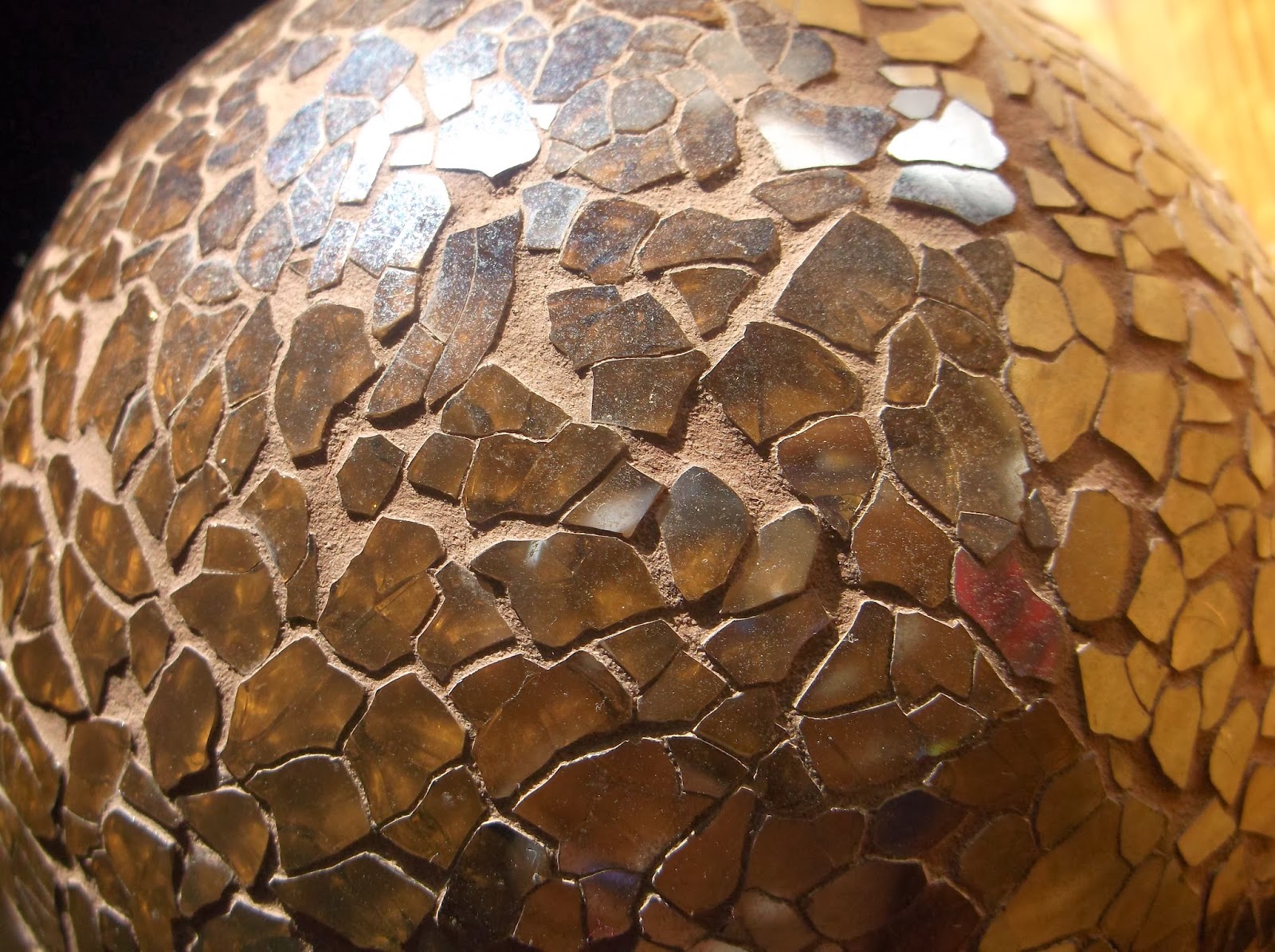
This is an ornament in my living room. I like it because it reflects a lot of light. I think this photo works because of the irregular pattern of the glass and warm colours. I also like the reflections in the small pieces of glass.
This is a close-up shot of a clock in my house. I think this photo is good because it follows the rule of thirds well because the subject is not centred, but further to the left. There is not much colour in this photo and it looks dull. I could improve it by introducing more colour into the photo.
This is a photo of a silk tie. I think the photo looks good because of the lines of the pattern of the tie and also the texture of the silk. I also like the lighting and shadows in this photo. I think the colours are a bit boring, apart from the vivid red, so I could improve the photo by making it more colourful.

This photo is of a frosted window. I think this photo looks good because of the pattern on the window and also the windowpane divider follows the rule of thirds and is on the right rather than in the centre. I used Photoshop to straighten the image so that the divider is straight and therefore easier to look at. I also used Photoshop to brighten the image as the colours were too dark at first.


This is a photograph of a broken pane of glass in a telephone box. I think this is a good photo because of the pattern of the broken glass and the bright red of the telephone box and very light blue of the glass. I also like the angle this photo was taken at. I think this photo could be improved with better framing. I think the photo would look better with some of the red telephone box showing at the top of the photo as well.


This is a photo I took of a Momiji message dollop my window sill. I like this because most of the photo is black and white apart from the bright red heart and the doll's face. I made the view outside of the window black and white using Photoshop to draw more attention to the subject, because the bright colours outside were distracting.

Monday, 10 February 2014

Take photographic images for a specific purpose

For my final project, I will take photos for three different purposes.
My three purposes will be:

  • Event 
  • Concept 
  • Portrait 

The event I will be taking photos for is a music event/concert. I think things like lights will be good for colours and patterns in my photos. 

The concept for my photos will be close-up/macro shots.


Monday, 3 February 2014

Cropping Images


This is a wide shot that I took in school of some bike rails. I think this image has a few points of interest that I would like the focus on. I will crop this image into four seperate smaller images, using the cropping tool in Photoshop. 

This is the first image that I cropped. I think the texture of the ground and the worn out pattern on the bike rail make this photo good. 


This is the second image. I had followed the Rule of Thirds and placed the subject of the image more to the left than the centre. 


This is the third image that I cropped. I cropped it this way because I believe the contrasting textures from the ground and the grass  complement each other well.


This is the final photo that I cropped of the bike rack. I think this photo is good because of the repetitive lines and pattern that is made by the metal bars. 


On all of the photos,  increased the exposure, brightness and contrast to make the textures stand out a little bit more, but kept it subtle.

Monday, 20 January 2014

Adjusting an Image


I found this image to adjust on Photoshop. I decided to make the image black and white, leaving one colour. I chose blue to keep. 
First, I duplicated the layer and made the background black and white. I then selected the blue parts on the second, coloured layer. I copy and pasted this and hid the second layer so that only the blue was in colour. Using the eraser tool, I tidied up the edges. 
This was the end result:

Here is another example. I used the same process, except this time, I kept the red in colour instead of the blue. 


Thursday, 16 January 2014

How to Upload/Manipulate/Store Photos

This is a diagram I drew demonstrating the steps to transfer images from a camera to a computer and save them digitally. I am then able to review these images and manipulate/edit them using Photoshop and upload them to my blog. I have followed these steps to upload this photo.

Thursday, 9 January 2014

Rule of Thirds


This picture is a bad example of the rule of thirds because the subject is in the middle. The eye is automatically drawn to the left or right side of an image so I should crop this according to the rule of thirds.


I have cropped this image in Photoshop so that the subject of the image is more in the left and better to look at.